Clubhouse
Mayfair
A cocktail club with no existing identity. Built from the ground up — logo, social, menus, and digital.
Clubhouse required a complete brand identity built from nothing — no existing visual direction, no inherited assets. The brief was to create a mark and visual language that could carry a premium cocktail club in Mayfair across every touchpoint.
01
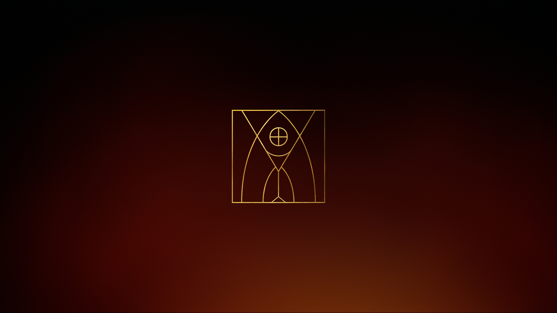
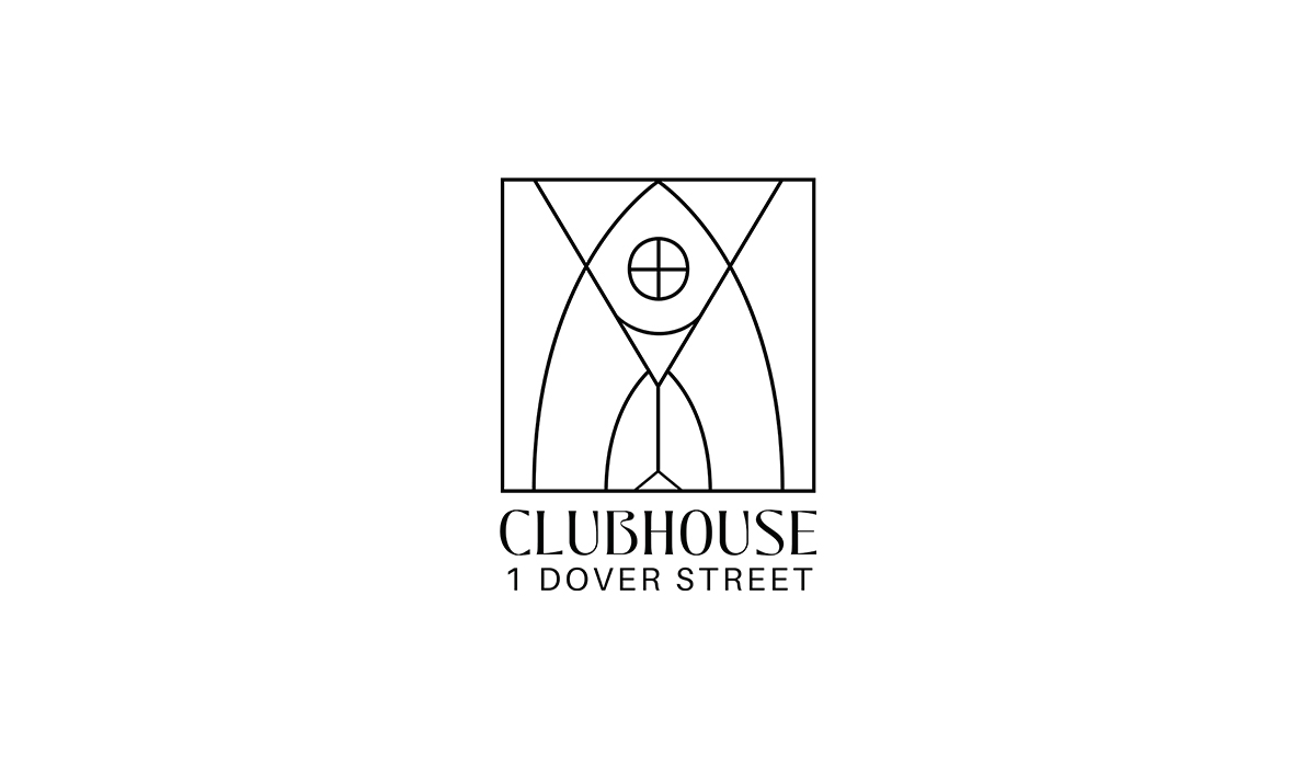
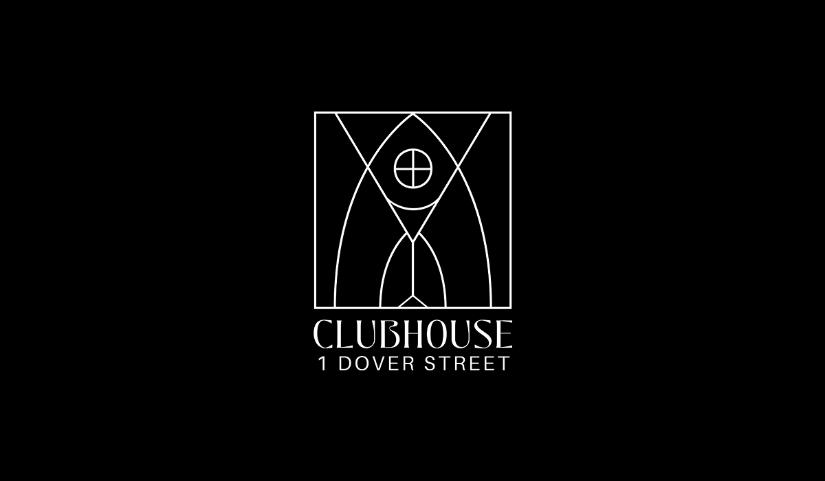
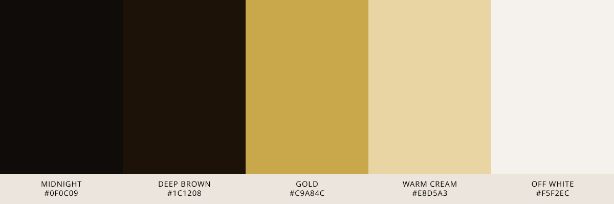
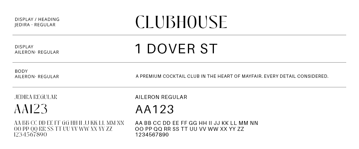
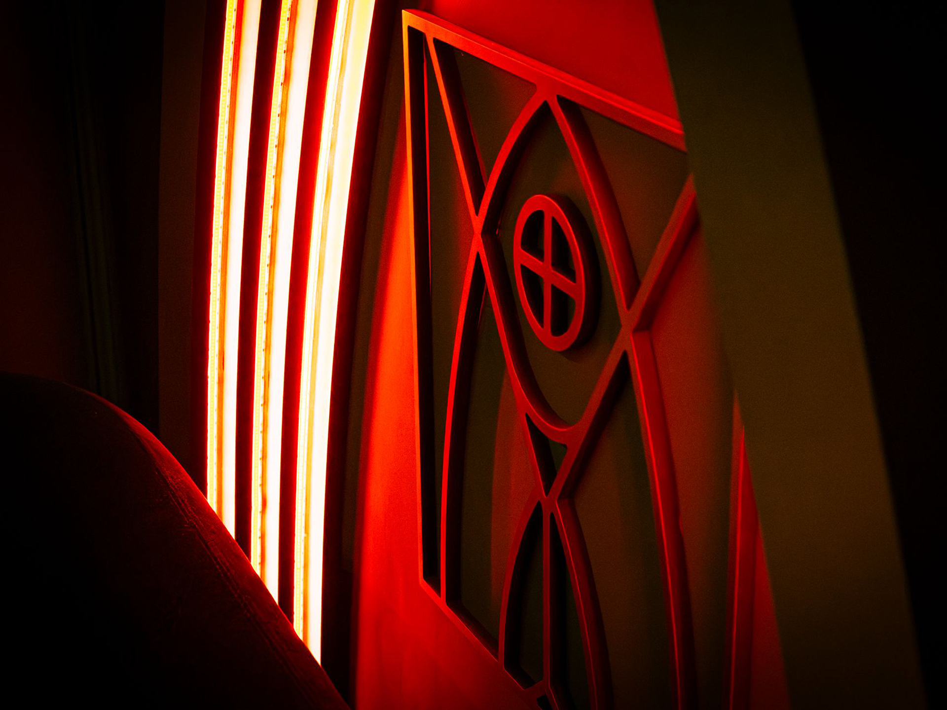
Logo & Identity
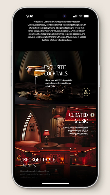
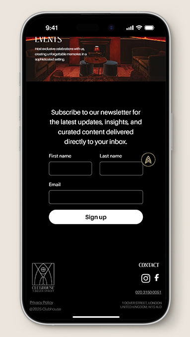
Mark, logotype, and colour system — designed to work across dark and light backgrounds, from printed menus to digital headers.
02
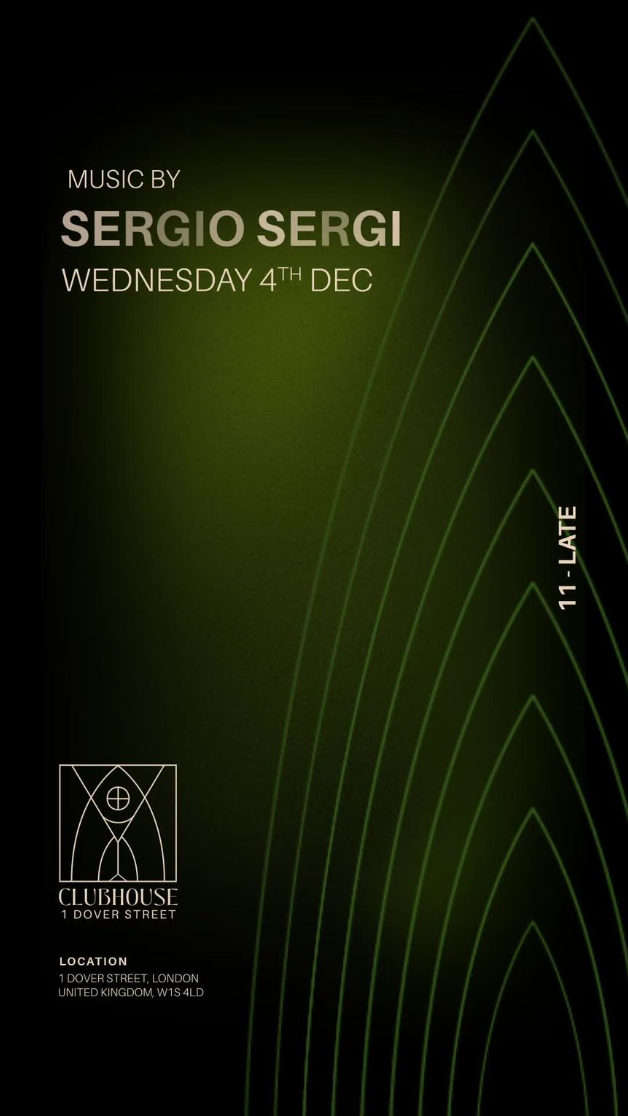
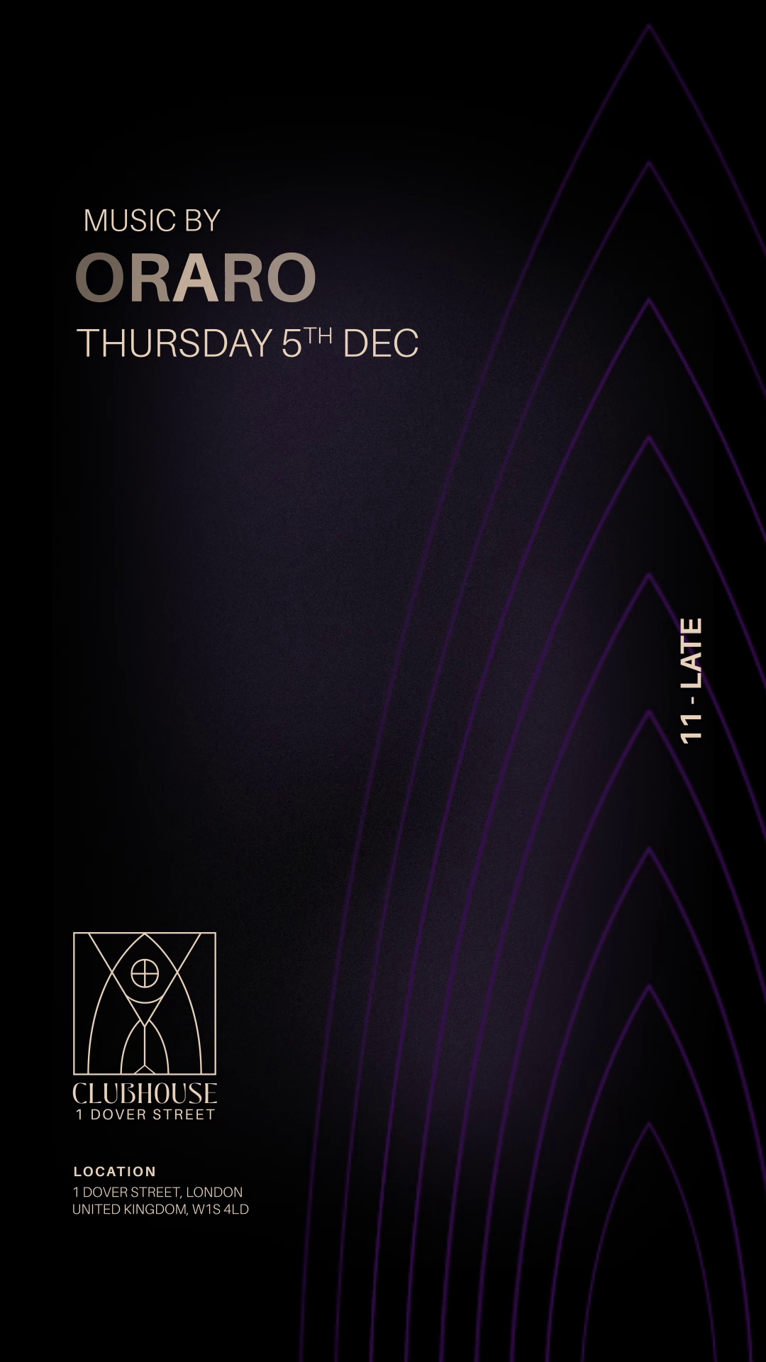
Social Media
Consistent visual language across event announcements, weekly content, and promotions. Designed to feel premium without being inaccessible.
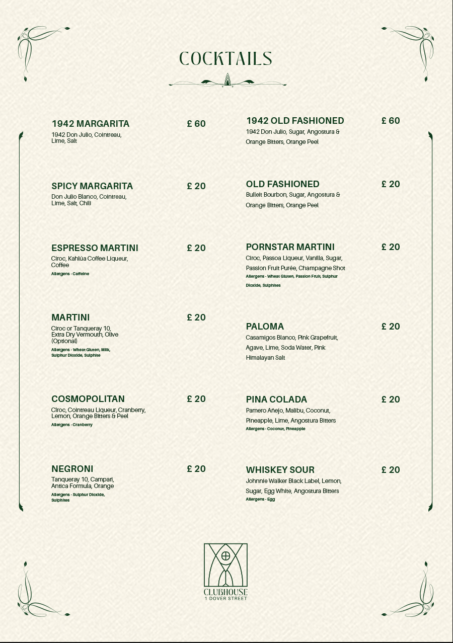
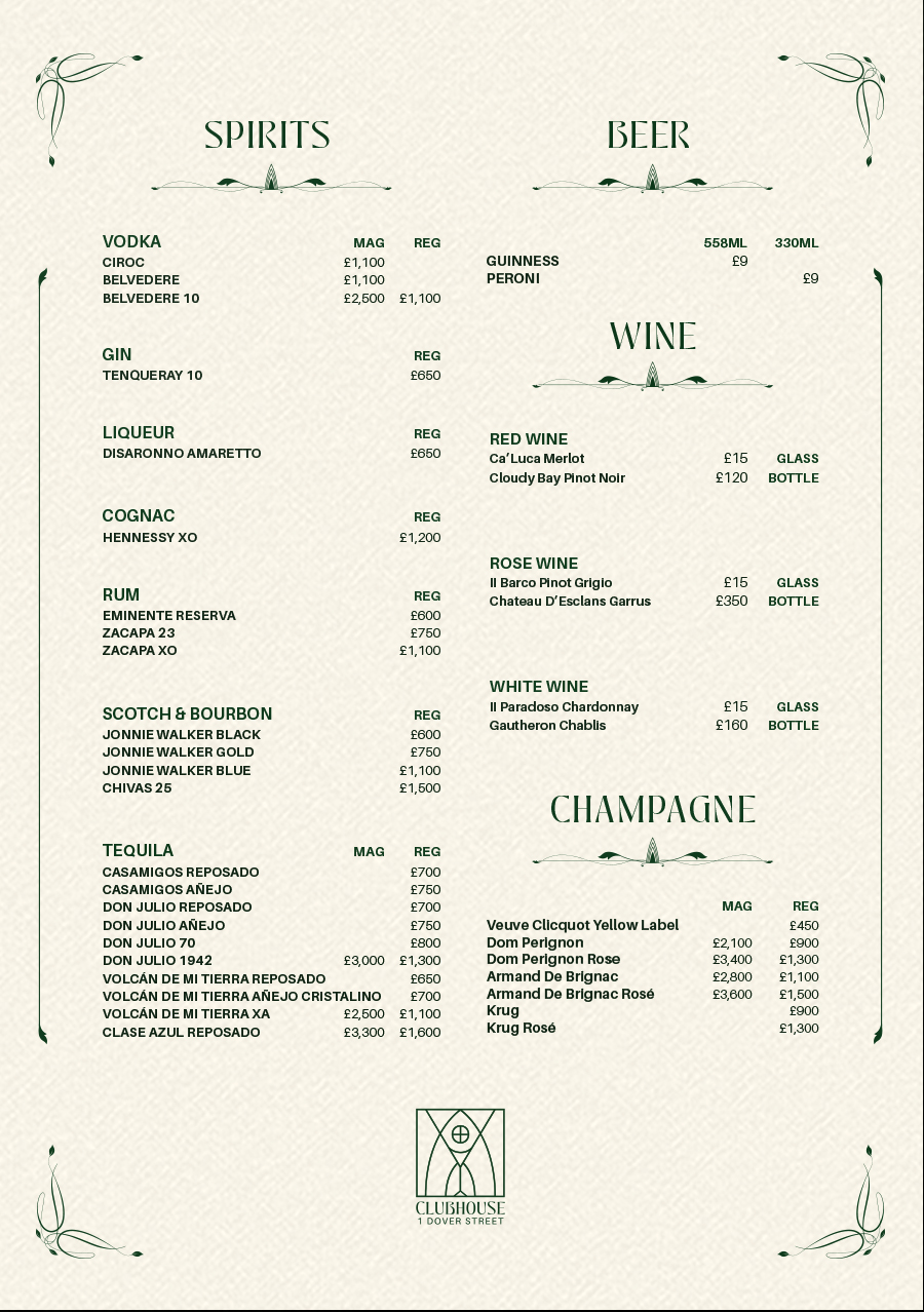
03
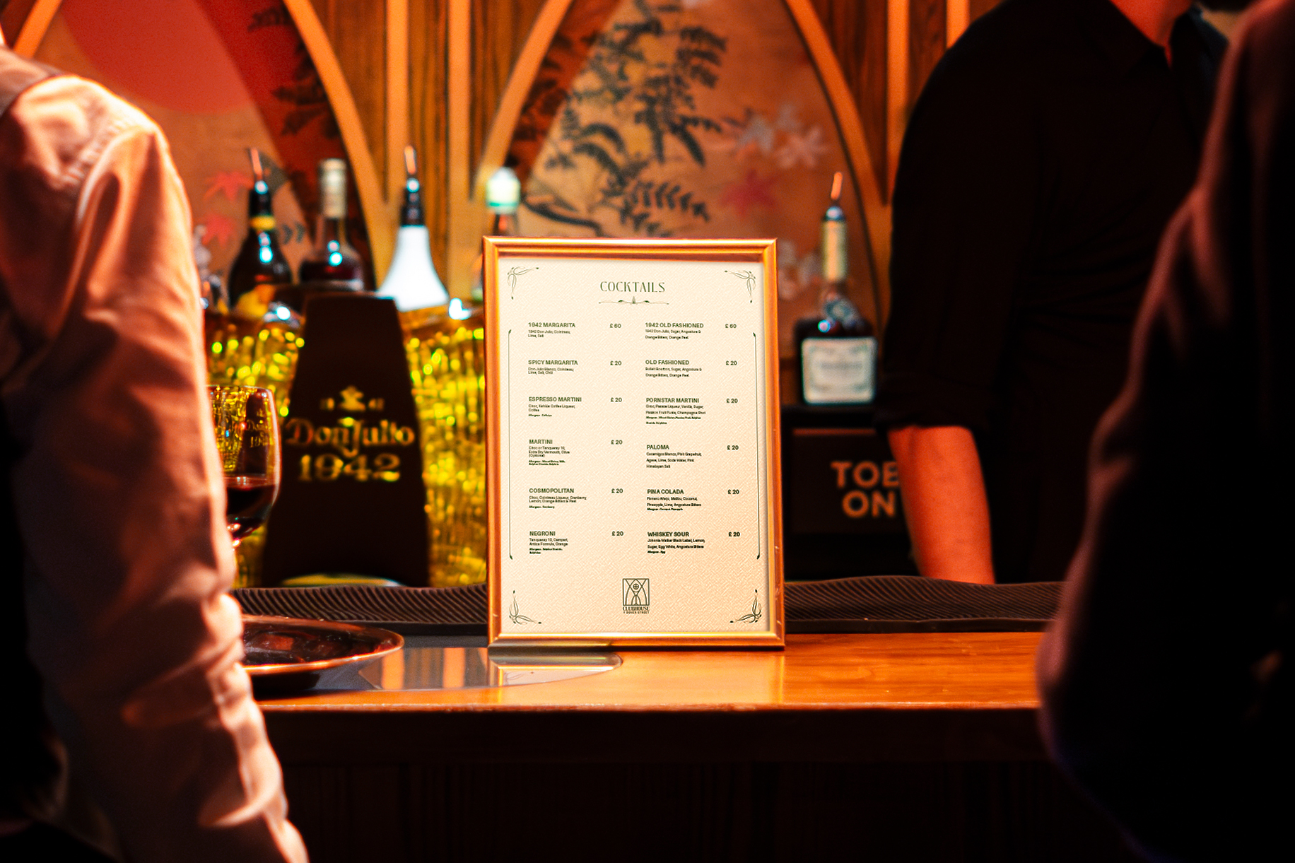
Menus
Cocktail and food menus — the brand applied to print. Typography and layout chosen to reinforce the premium feel established in the identity.
04
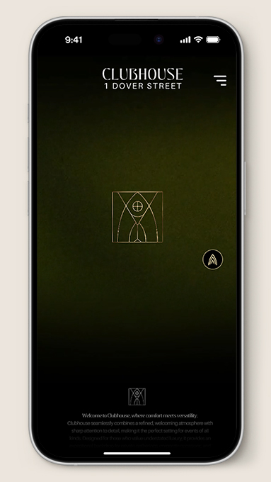
Website
Landing page and booking flow, built on the established brand identity. Designed for mobile-first with a focus on conversion.
Visit site ↗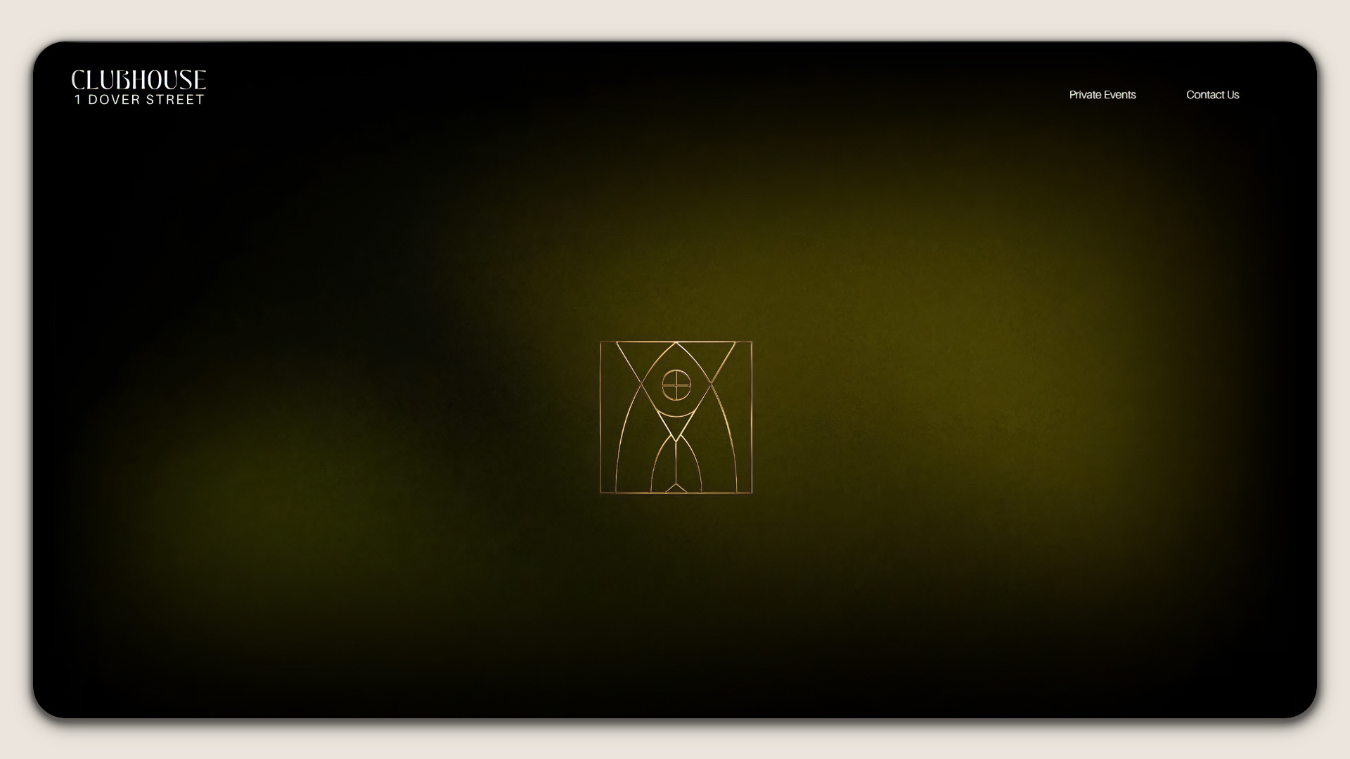
05
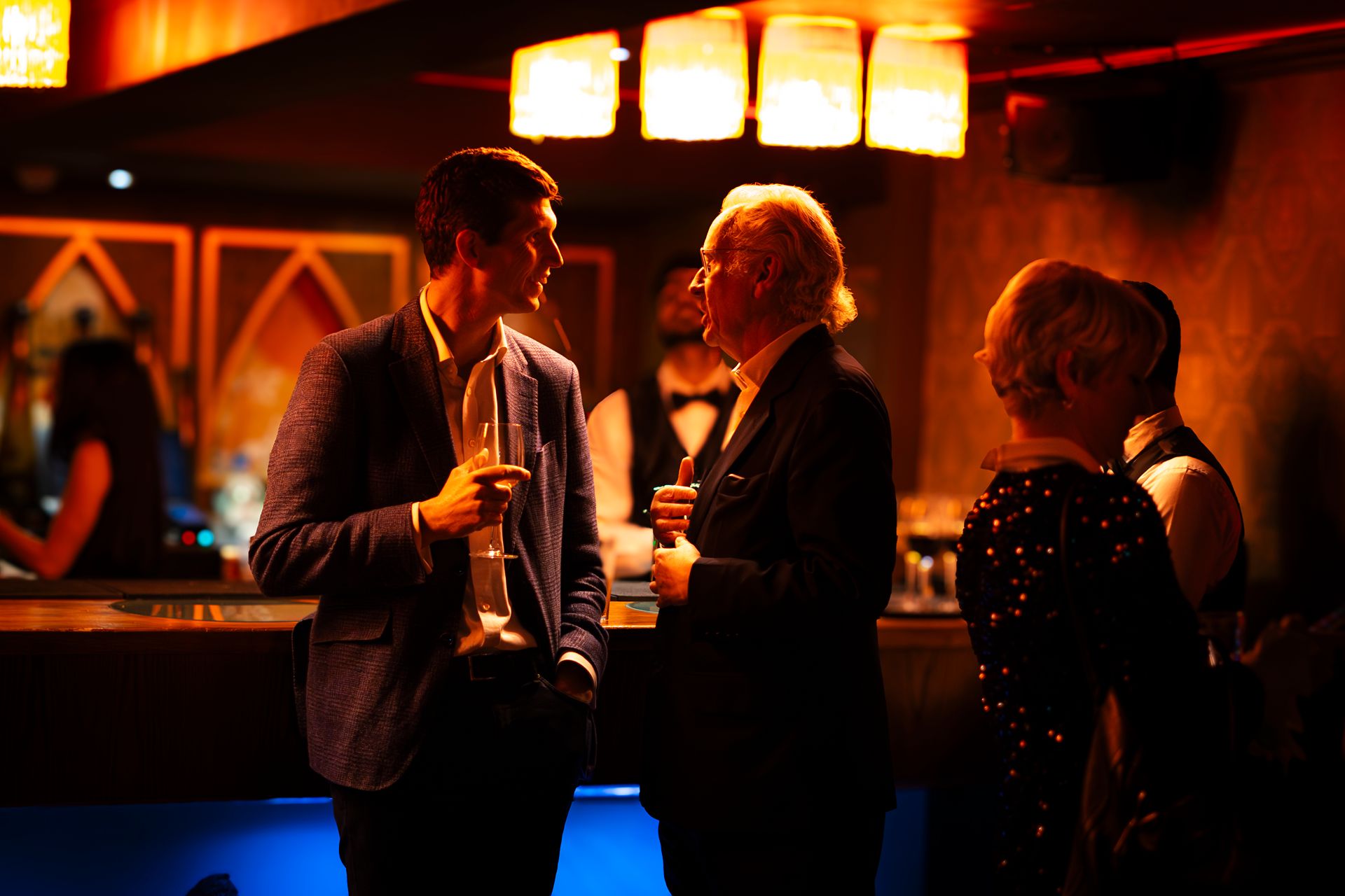
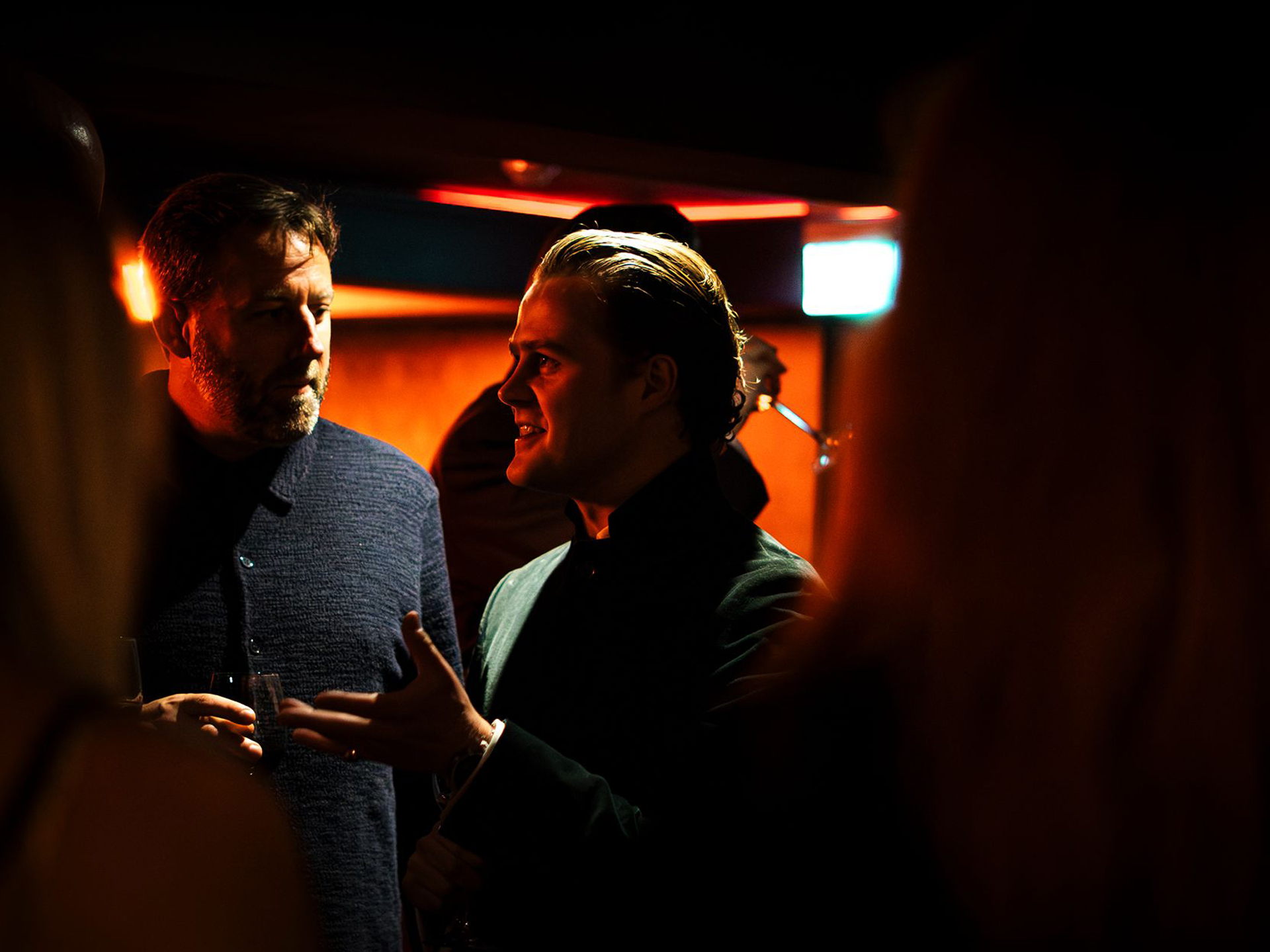
Photography
Event photography shot on-site at Clubhouse — capturing the atmosphere and energy of the space in action.
The identity is now live across all Clubhouse touchpoints — social, print, and digital — establishing the venue's visual presence from launch. Built and deployed without an external agency.
This project reinforced how important a coherent type and colour system is when work needs to stretch across formats as different as a printed menu and an Instagram story. Establishing those constraints early made every subsequent deliverable significantly faster to produce.
© 2026 Ataberk Kurtulan, All Rights Reserved.